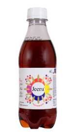
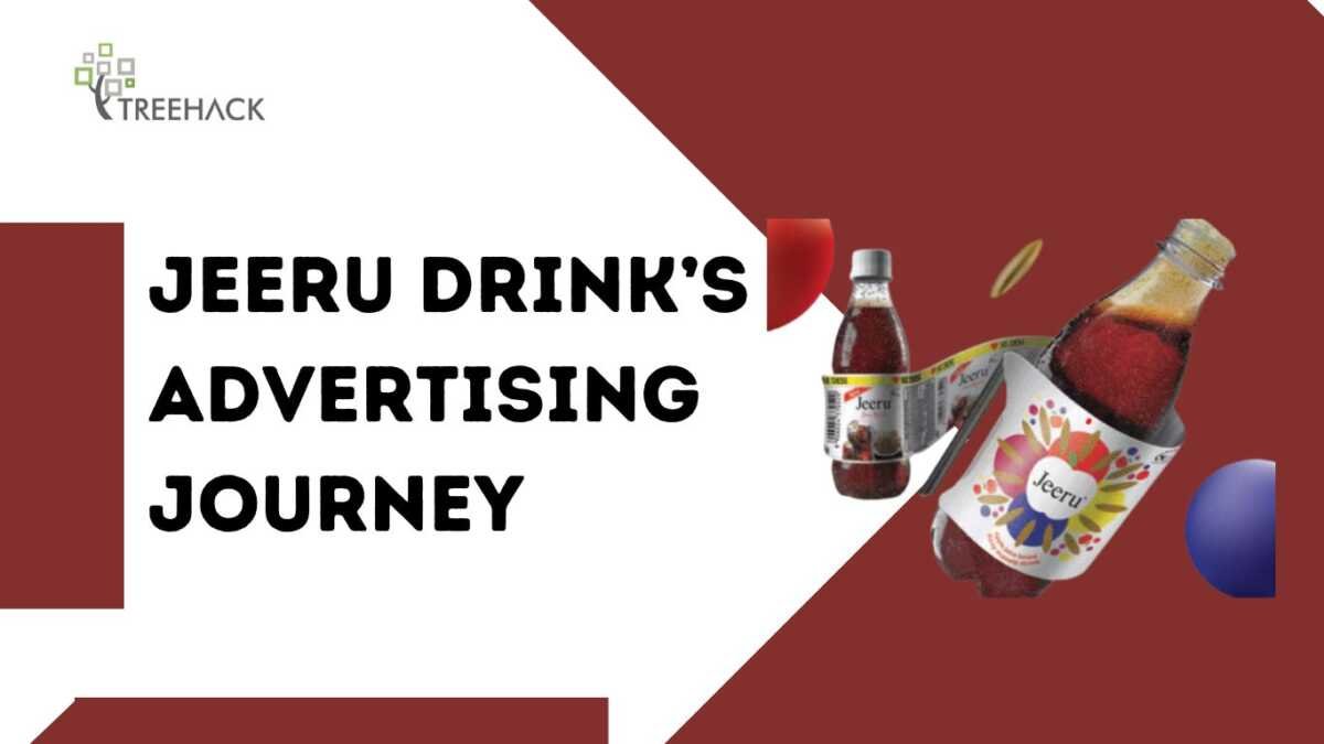
Jeeru to J brand journey, Xotik Frujus launched its product Jeeru in 2007, which was the first jeera soda ready to drink in India. It was a modest product in Mumbai and Surat but gained tremendous acceptance throughout the country. The taste of Jeeru which was different from the market and purely Indian, spread through word-of-the-mouth. Currently, the brand is rebranding itself to ‘J’ with the aim of targeting the younger audience by providing an alluring new look.
From Word-of-Mouth to Brand Leadership

Jeeru thrived on authenticity and flavor. Without heavy marketing campaigns, its strong distribution network and loyal customer base did the talking. Word-of-mouth proved to be Jeeru’s most powerful tool. Consumers loved its desi taste, which made Jeeru synonymous with the jeera soda category.
According to Anjana Ghosh, CEO of Xotik Frujus, “Word-of-mouth is the most powerful medium of marketing because loyal consumers act as brand ambassadors.”
Evolving for New Audiences
In a cola-dominated market, Jeeru made a courageous decision by changing its positioning. The newly branded ‘J’ is looking to change itself from being a digestive drink and expand itself to the masala soda category, available for any and every occasion.
But the rebranding is clearly more than just packaging; it’s also about appealing to and engaging with a broader segment of society in particular the younger generation, the Gen Z. ‘We have moved past offering Jeeru as a goli and emphasised it more as a drink for every moment,’ says Anjana ‘There’s also the need to reposition the drink from nostalgia to a more modern and relevant space.’
The Look: Vibrant and Youthful
The redesigned ‘J’ comes out stronger with 6 bold colors and cleaner look that is necessary to compete in the tough marketplace. The logo is simplicity at its most sophisticated as it is only a single letter ‘J’, easily appealing to youthful consumers who appreciate a stylish and upbeat look.
“The purpose of the new design is to enhance brand recall by having a more distinct brand identity with a sharper focus on New India,” shares Anjana.
Marketing the New ‘J’
Xotik Frujus aims to utilize a ₹20 crore marketing budget, and through the use of digital, social media and OOH campaigns along with ground level activation intends to expand its reach to the masses. It is going to be a year long strategy that guarantees the new look brand will appeal to its existing and target customers who are younger in age
Conclusion: Bridging Nostalgia and Modernity
Jeeru to J brand journey, Jeeru evolves into J but stays true to its roots while adapting to the current generation’s demands. With its eye-popping shrink sleeves, contemporary advertising campaigns, and forefront creative gold medal flavours, J is destined to be the beverage of choice for young India.


